About the Project
Craft Journal is a digital tool that helps users document their creative projects. Users can save photos, add materials, track time spent, rate difficulty, and organize entries using a calendar and tags.
Target Users
- Creative People
- Artists who want to track their progress
- People who enjoy organizing their projects
- Everyone who wants to reflect on their progress
Use Case
A user completes a crafting project and opens the app to create a new entry, adding the date, materials used, time spent, photos, and notes. Later, they browse previous entries through the calendar to reflect on past projects or search by tags.
Team & Contributions
- Fiona Walatscher & Sofija Radojević
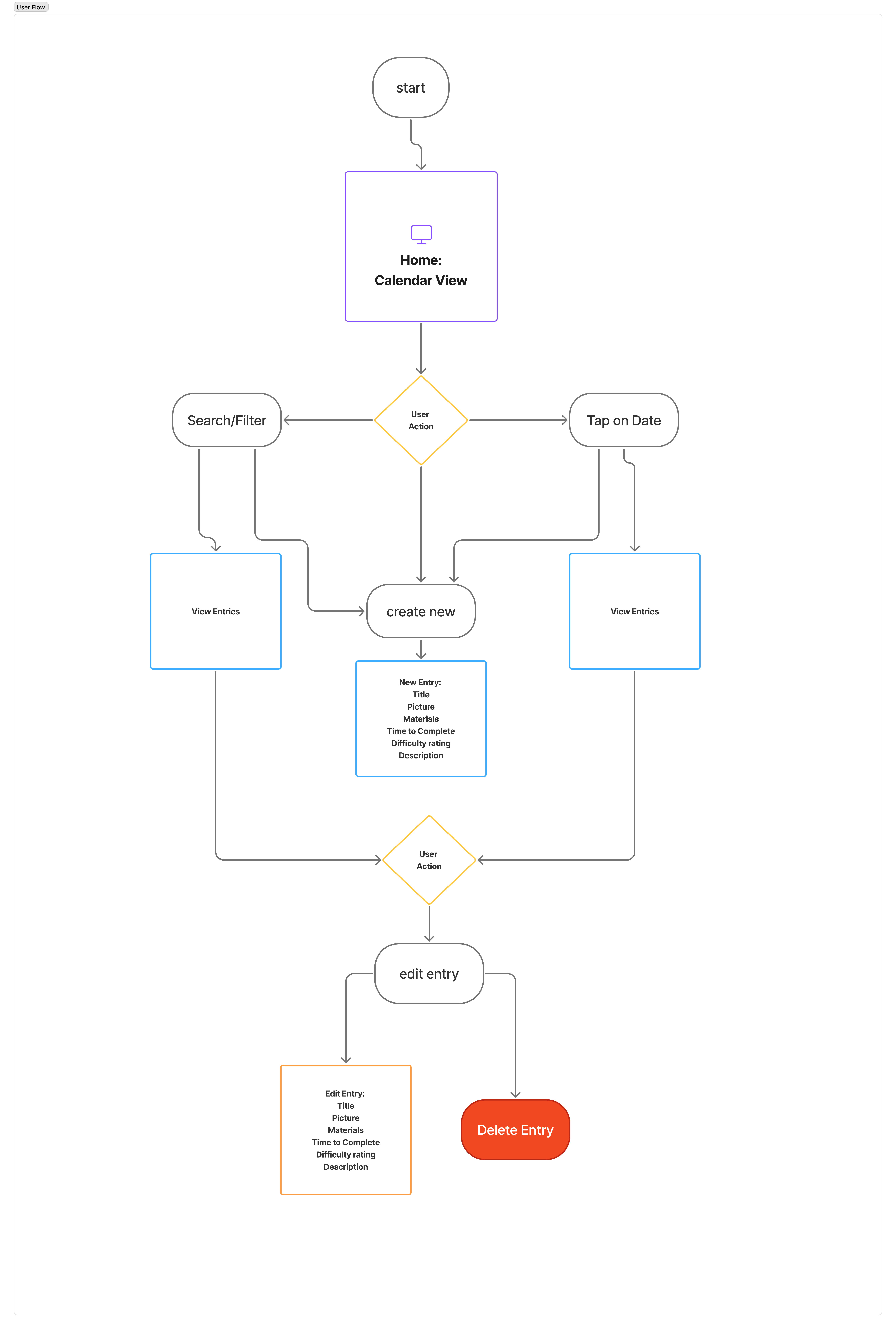
Userflow
The diagram below shows the main flow: calendar view → choose date → create/edit entry → save/delete.
App Design
Figma Prototype
Interactive design prototype used for planning the app layout and user flow.
Design of the SQLite Database
Entity Relationship Diagram (ERD) for the database design.
Reflection
Fiona Walatscher
I started the coding part of our CCL3 project by using my mobile coding final project as a reference/base for setting up our Craft Journal app. Many of the base functions were already there, like the ability to add, edit and delete entries (crafts), including multiple different text inputs and the ability to add images, as well as a page with all entires shown as preview cards. After the base version of our app was running, I started working on the tag system, which luckily did not take long to implement, and then I implemented the search page with its functionality of filtering crafts by tags. By the end of the week I wanted to start with the styling already, but unfortunately ran into a lot of bugs that needed to be fixed before I felt comfortable to start with the styling. Sofija helped me fix most of those bugs and friday night I finally started with the styling. After doing the „base styling“ I changed the image add feature so that you could now only add one image instead of multiple, so that the design could be finally finished and would fit the Figma prototype we presented on monday. The second week consisted of doing user tests, the preparation of which we did on the weekend. After Sofija did the pilot test on monday I did a handful of user tests on tuesday, so we could start analysing the data on thursday. I calculated SUS scores and prepared simple graphs to show the results of our user tests. Working on the code part of the project was more complex than expected. I thought that the fact that we used my MC project as a base would help keep the coding work to a minimum, but we ran into a lot of errors before everything worked as intended. The styling did take almost an entire day (as I expected), but it was easy to work through everything in one go. The user tests went really well, and I think a reason for that is that we learned a lot from our user tests in UEE. Because of that we, for example, decided to not measure total time on task, as we felt the balance between effort and gain was not worth it. Our test participants also had very useful insights this time around, which made the testing process extremely interesting and fruitful!
Sofija Radojević
Fiona set up the initial project structure, and I focused mainly on implementing the calendar view and the functionality for adding crafts directly via the calendar. I also worked on the overview section displayed underneath the calendar and restructured parts of the project to follow an MVVM architecture. In addition, I contributed to features and refinements throughout the codebase where needed.
We both conducted the user study. After I ran the pilot test on Monday, we carried out several user tests over the following days. While Fiona focused on analysing the results, I worked on summarizing the findings and integrating them into the written documentation.
Overall, the final application reflects our initial concept of a digital craft journal that allows users to document projects, organize them by date, add images and tags, and reflect on difficulty. The core functionality we envisioned in the concept phase was successfully implemented and tested with users.
Time was definitely a challenge, as the development process was highly iterative and often felt like going in circles ( whenever one bug was fixed, another appeared). It was also challenging to maintain a coherent visual design while ensuring the app followed UX principles and guided users intuitively through the App.
One piece of feedback indicated that the app’s USP was not entirely clear. A possible future improvement could be i a database of craft ideas to further strengthen the app’s purpose. However, we are happy with the current state of the app and the functionality achieved within the given timeframe.