User Study
We conducted a usability and user experience evaluation of the Craft Journal app to understand how easily users can create, edit, and organize their creative projects. The study combined a heuristic evaluation based on Nielsen’s 10 usability principles with a task-based user test.
Study Setup
- Participants: 7 mobile users (ages 18–64, mixed gender)
- Device: Android smartphone
- Method: Moderated usability test with think-aloud protocol
- Tasks: Create, view, edit, delete, and search for craft entries
- Measures: Task success, errors, SEQ, SUS, user comments and moderator observations
Study Goals & Hypotheses
Goals
We evaluated how easily users can:
- Navigate around the calendar
- Create craft entries
- Edit existing entries
- Understand key features (difficulty rating, hours spent, tags)
- Navigate between screens
Hypotheses
- Users may experience difficulties when using the search and filter functions without additional guidance or instructions.
- Users may require an adaptation period to become familiar with the layout and visual structure of the Add and Edit screens before using these features efficiently.
Planned Data to Collect
- Quantitative: Task success rate, number of errors, SEQ, SUS
- Qualitative: User comments and moderator observations
Main Findings
Most participants were able to complete the core tasks, but several usability issues occurred. Users often struggled with the search and filter functions, especially because the default “No crafts found” message was confusing. Missing feedback after saving or editing entries made users unsure if their actions were successful.
Key Problems Identified
- Unclear search and tag filtering interface
- No confirmation messages after editing or saving entries
- Confusing tag creation flow (Add Tag → Save)
- Difficulty rating system felt unclear to some users
- Calendar interaction was not obvious to first-time users
Changes made after conducting the User Study
Based on user feedback, we prevented saving empty crafts to avoid confusion and added a clear message prompting users to fill in all required fields. Additionally, we adjusted the visual design of the tag selection to improve clarity and workflow.
Changes made after presenting and Victor’s feedback
Since finishing the onsite CCL, we made the following changes:
- Added back buttons to all screens for easier navigation
- Added the possibility to choose and edit the date of a craft entry
- Made the detail view scrollable
- Improved the intuitiveness of the tag selection through visual tweaks
- Show all crafts by default on the search screen
- Ensured the date view only displays crafts for the selected day
- Introduced an intro screen shown only on first app launch
- Animated the “please fill in all fields” validation message
- Increased background transparency for better readability
Overall Conclusion
The design was generally well received, but improvements are needed in system feedback, navigation clarity, and the tag/search features. Clearer UI and better error messages would improve the user experience.
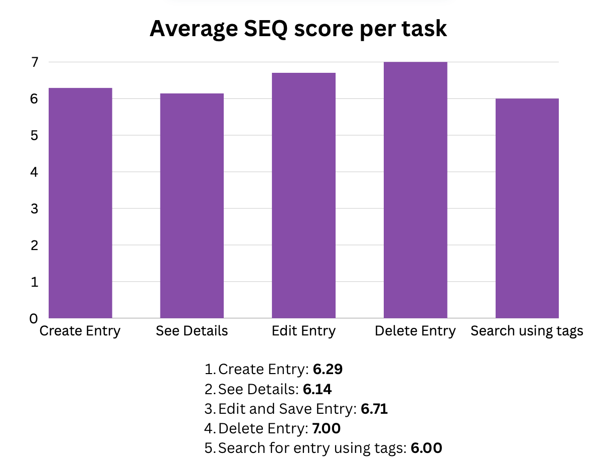
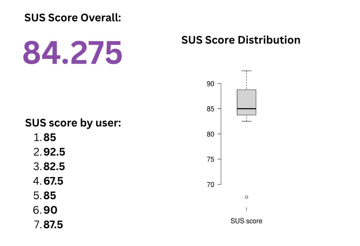
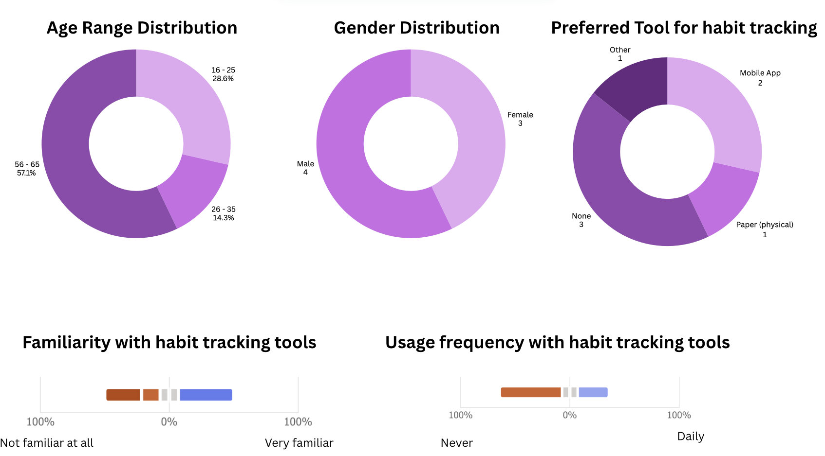
Selected Results
Below are some visual results from the user study showing task performance and questionnaire scores as well as the participants' demographics.
Full Report
The full user study is embedded below in its original PDF format.